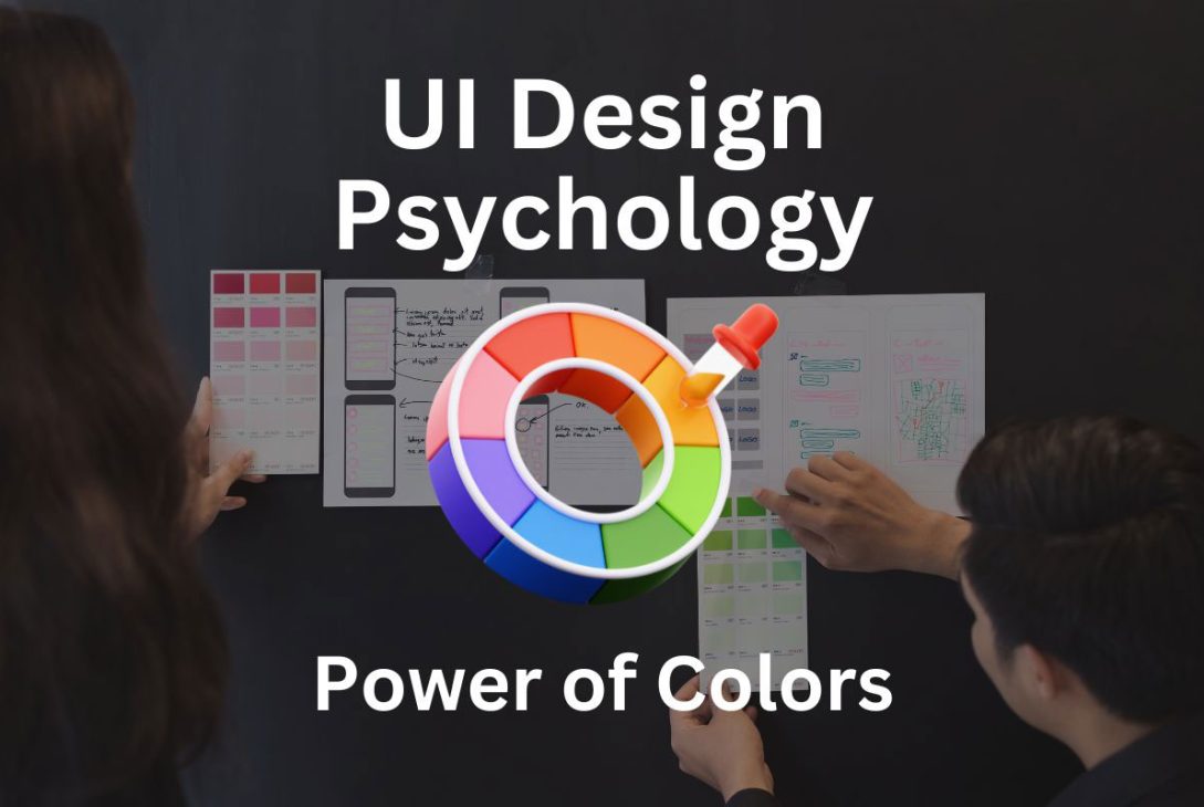
Color is a fundamental aspect of the visual world, exerting a profound influence on our emotions, behaviors, and overall perception. Within the realm of User Interface (UI) design, colors hold a pivotal position, significantly shaping user experiences and interactions. This article delves into the depths of UI Design Psychology, unraveling the intricate relationship between colors and human psychology. Discover how a strategic approach to color implementation can elevate user engagement and satisfaction in UI design.
Table of Contents
The Role of Colors in UI Design Psychology
Colors are more than just aesthetically pleasing elements in design. They are communication tools that convey messages, evoke emotions, and guide user behavior. Understanding the psychological implications of colors is vital in creating an effective UI design.
Brief Overview of Color Psychology
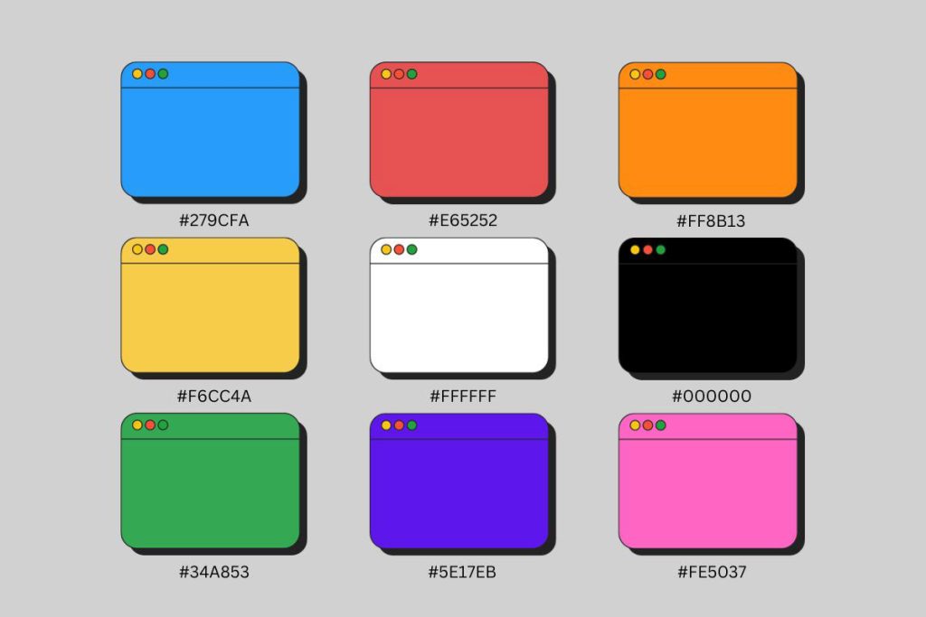
Color psychology is the study of how colors affect human behavior and emotions. Different colors evoke distinct emotional responses and can influence our decisions and perceptions. Let’s delve into some of the most common colors and their psychological effects.
Color and Emotional Connection
Color has a powerful ability to evoke emotions and connect with users on an emotional level. Here are some examples:
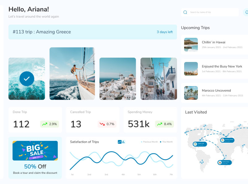
Blue Color UI Design
Emotional Impact: Blue is often associated with trust, calmness, and reliability. It can evoke a sense of security and tranquility, making it ideal for financial institutions’ UI designs.
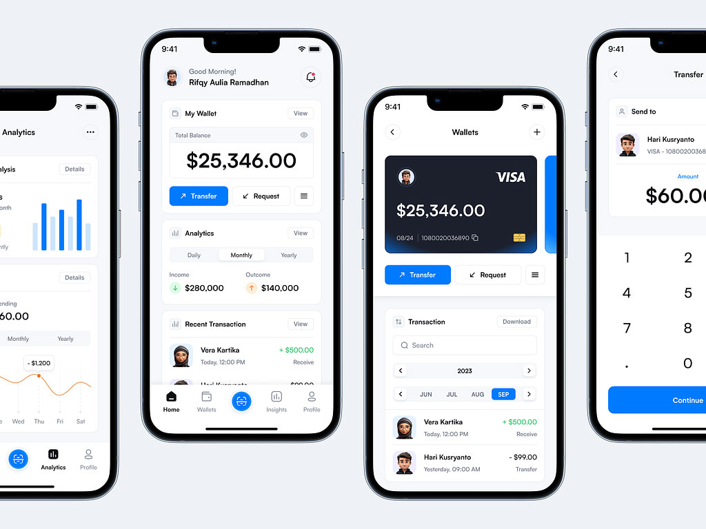
Resource: https://dribbble.com/shots/22530702-Finflex-Financial-App
Red Color UI Design
Emotional Impact: Red is a highly stimulating color that can evoke strong emotions such as excitement, passion, and urgency. It’s often used to draw attention or convey a sense of urgency in UI elements.
Resource: https://dribbble.com/shots/19159236-F4-Issue-Tracking
Orange and Yellow Color UI Design
Emotional Impact: Orange and yellow are energetic and vibrant colors. They evoke feelings of enthusiasm, happiness, and warmth. These colors are great for creating a friendly and inviting UI.
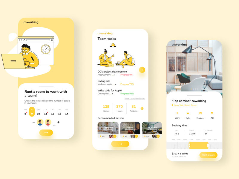
Resource: https://dribbble.com/shots/13939409-Mobile-app-coworking
Color Associations and Cultural Influences
Colors can have different meanings and associations across various cultures. Understanding these associations is crucial for designing globally appealing UIs. Let’s examine a few examples:
White Color UI Design
Cultural Variation: In some Western cultures, white symbolizes purity and cleanliness, often associated with weddings and healthcare. However, in certain Eastern cultures, it represents mourning and death.
Black Color UI Design
Cultural Variation: Black can symbolize elegance and formality in Western cultures. In contrast, it might denote grief and sorrow in certain Eastern cultures.
Resource: https://dribbble.com/shots/4606370-UI-DESIGN-EXPLORATION
Color Harmony and User Experience
Creating a harmonious color palette is essential for an aesthetically pleasing UI design that encourages a positive user experience. Here’s how you can achieve color harmony:
Green Color UI Design
Harmonious Combinations: Green pairs well with earth tones like brown and can create a calming and natural ambiance, making it suitable for environmental or wellness-related applications.
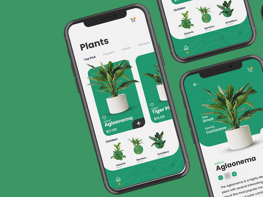
Resource: https://dribbble.com/shots/14496933-UI-Design
Purple Color UI Design
Harmonious Combinations: Purple complements gold or silver accents, giving a sense of luxury and sophistication, making it an excellent choice for premium products or services.
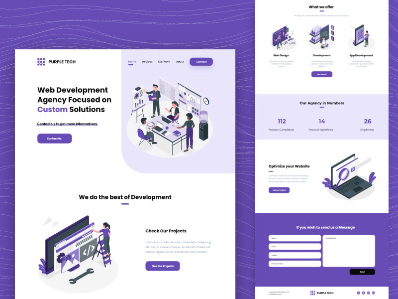
Resource: https://dribbble.com/shots/14835528-Development-Agency-Purple-Website-Design
Color Accessibility and Inclusivity
Pink Color UI Design
Designing for Color Vision Deficiencies: Pink can be challenging for individuals with red-green color blindness. It’s essential to use contrasting colors and labels to ensure readability.
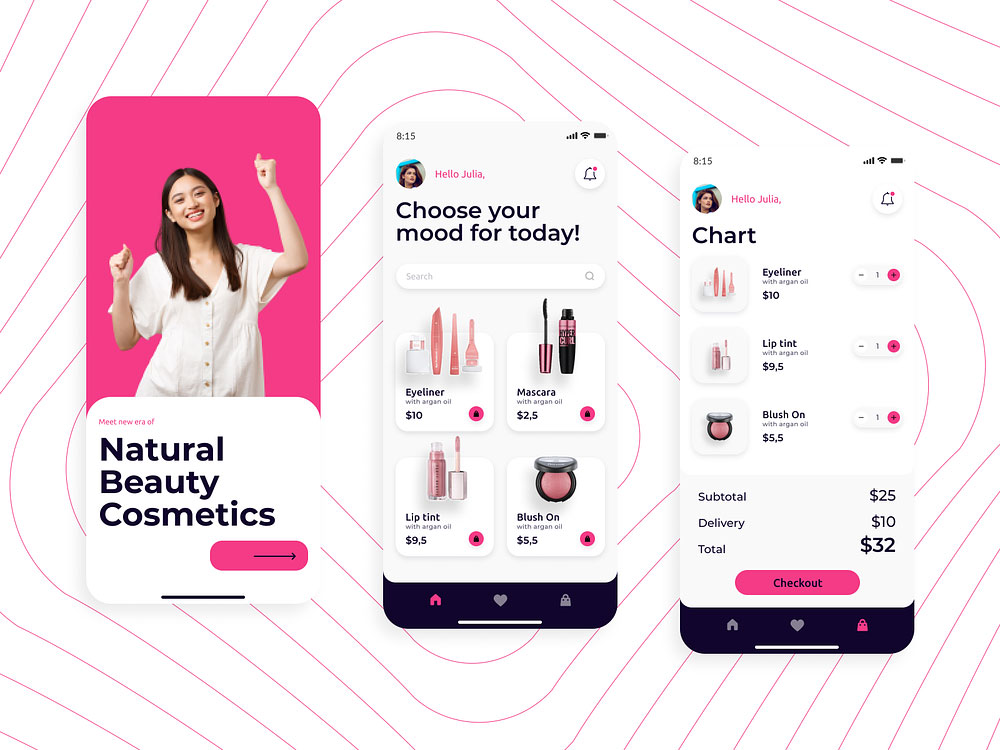
Resource: https://dribbble.com/shots/16540060-Cosmetics-App
Blue and White Color UI Design
Designing for Color Vision Deficiencies: Blue and white color combinations can sometimes be difficult for individuals with blue-yellow color blindness. Using additional cues like patterns or textures can enhance visibility.
Resource: https://dribbble.com/shots/14987826-Explorian-Travel-Dashboard
Choosing the Right Colors for Your UI
Choosing the right colors for your UI design is a blend of art and science. Consider the following strategies:
E-commerce Interface
Implementing shades of blue for a more trustworthy and secure shopping experience, coupled with strategic red elements for highlighting promotions and discounts.
Resource: https://dribbble.com/shots/14718552-eCommerce-UI-Kit
E-Book App
For an E-Book app, consider using a combination of soothing colors like light blue or green to create a calming reading environment. Dark text on a light background enhances readability and reduces eye strain during prolonged reading sessions.
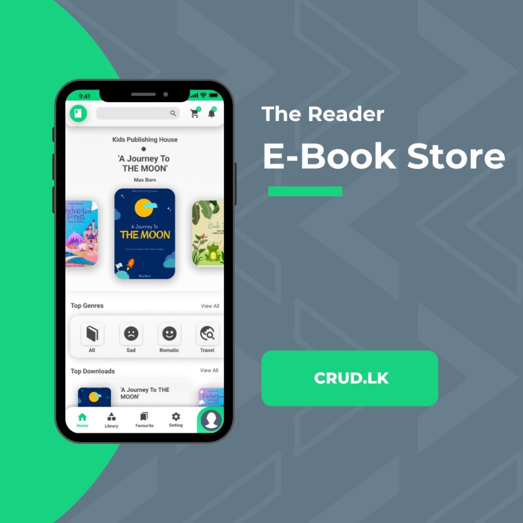
Resource: https://crud.lk/portfolio/the-reader/
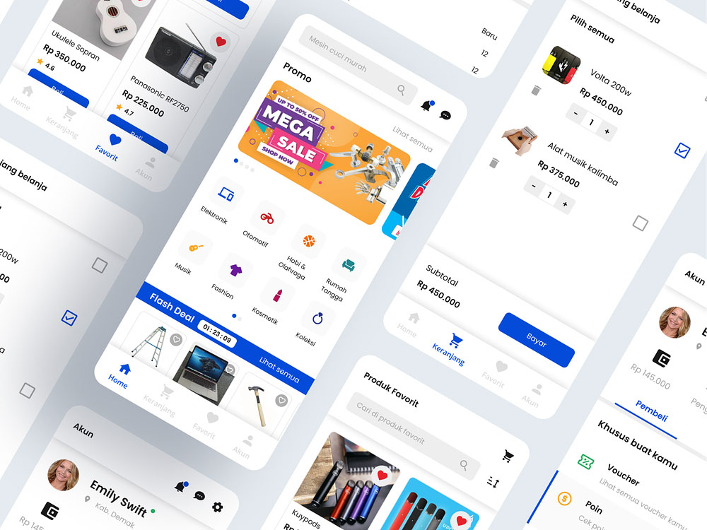
Multi-Vendor Web and App
In a multi-vendor platform, a neutral background like white or light gray provides a clean canvas for products to stand out. Use a contrasting accent color, such as a vibrant orange or green, to highlight important actions like “Add to Cart” or “Buy Now.”
Resource: https://dribbble.com/shots/14966131-Eboyo-Ecommerce-UI-Kit
Music Player
Music apps often opt for dark backgrounds (black or deep gray) to accentuate album artwork and create a dramatic, immersive experience. Use dynamic accent colors that change based on the album cover to add excitement and reflect the mood of the music.
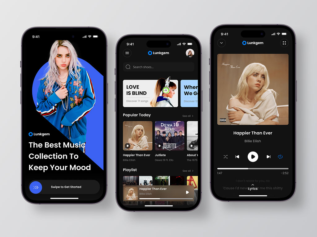
Resource: https://dribbble.com/shots/21497126-Lunkgem-Mobile-Music-App
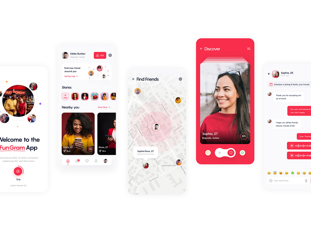
Dating App
Dating apps benefit from using a mix of warm and inviting colors like red or pink to evoke feelings of love, romance, and excitement. Incorporate softer tones to create a comfortable and friendly atmosphere, promoting trust and connection.
Resource: https://dribbble.com/shots/22644113-Social-media-app-Networking
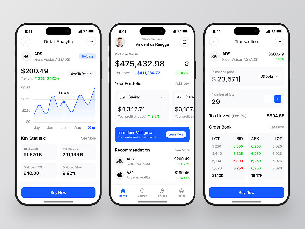
Trading Website and App
Trading platforms often employ a combination of professional colors like navy blue and white to convey trust and reliability. Accents of green and red can signify positive and negative movements in stock prices, aiding users in making informed decisions.
Resource: https://dribbble.com/shots/22687133-Vestgrow-Investment-App
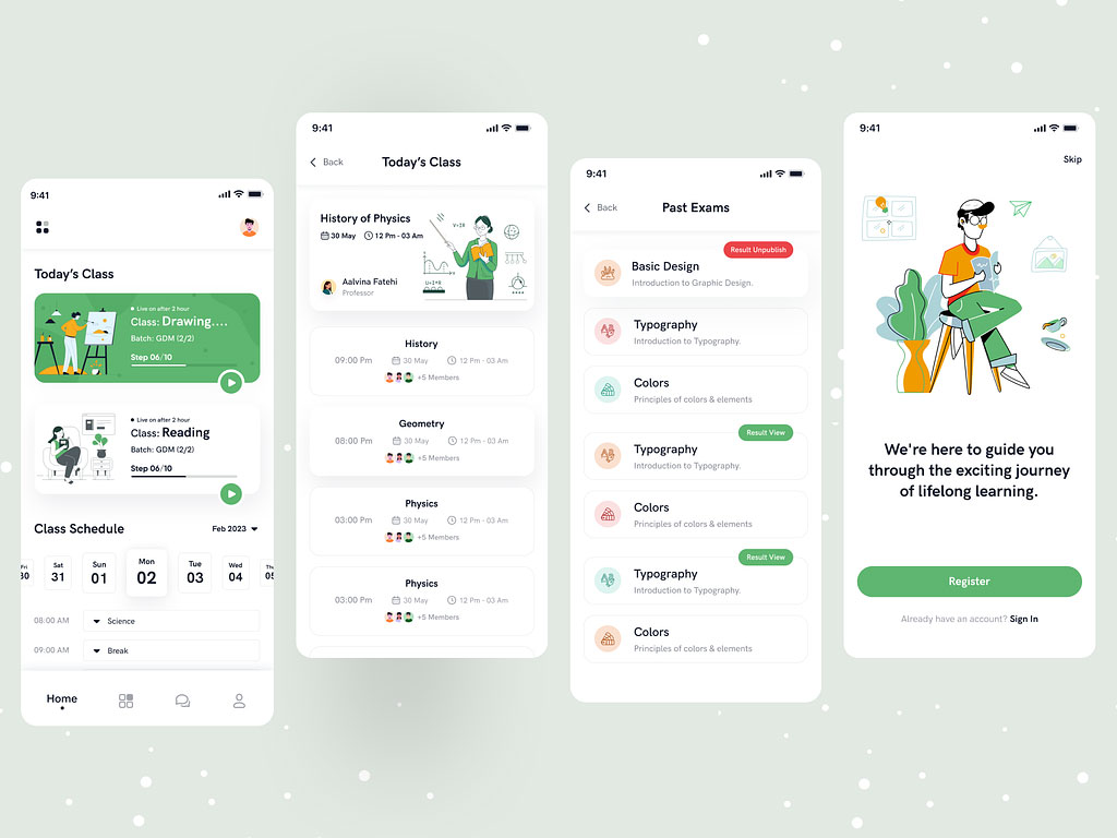
Educational Platform
Educational apps can use a palette featuring bright and engaging colors like yellow, blue, and green to stimulate learning and creativity. Pair these with a neutral background for readability and focus during study sessions.
Resource: https://dribbble.com/shots/22514998-Education-App-UI
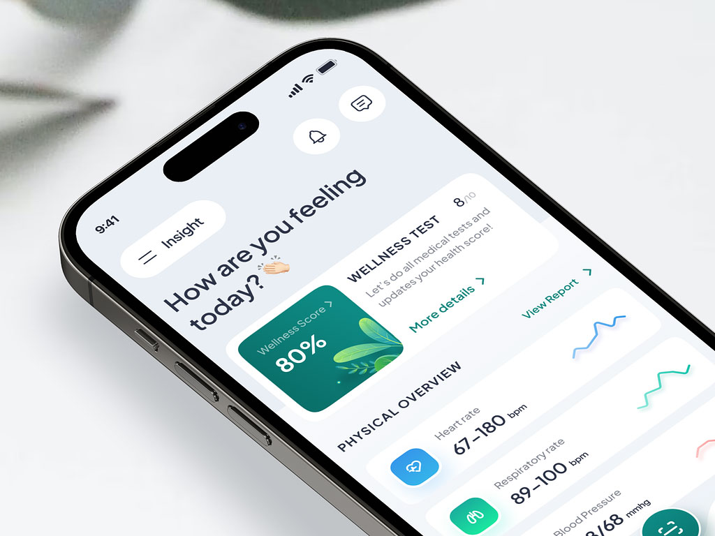
Health and Wellness App
Health and wellness apps should lean towards calming and nature-inspired colors such as green and blue to convey a sense of tranquility and well-being. Incorporate accents of energetic colors like orange to encourage motivation and progress tracking.
Resource: https://dribbble.com/shots/22729358-Telemedicine-Mobile-App-Healthpal
Conclusion
Comprehending UI Design Psychology, especially regarding the psychological impact of colors on user behavior, is a crucial facet of contemporary UI design. Designers can elevate the overall user experience by tactically choosing and integrating colors, crafting visually pleasing and emotionally captivating interfaces. As the landscape of UI design advances, embracing the influence of color psychology continues to be an indispensable asset for designers dedicated to developing outstanding user interfaces.